- July 26, 2024
-
-
Loading

Loading

Organization: Hype Group, St. Petersburg.
Brooke Boyd founded the firm in 2009 after several years at a large Fort Myers ad agency, where she ran accounts and headed public relations. The 14-employee firm now does everything from food and beverages to condo projects and shopping centers. Work includes branding, graphic design, public relations, social media management, campaign development and web design/development. “We build brands and tell brand stories,” says Boyd. “But we’re not just a branding firm. It’s a full on creative.”
Client: Pabst Brewing Co., a Los Angeles-based brewing company behind a list of brands including Pabst Blue Ribbon, Schlitz and Old Style. “They weren’t looking to be just another number,” Boyd says. “They wanted to be with a boutique firm that understood them. They could’ve gone with a lot of different firms, from Chicago or L.A. or New York.”
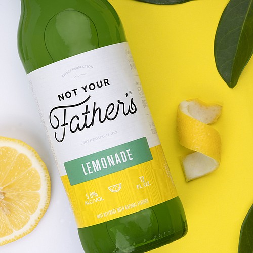
Task: In 2015, Pabst launched a soda-style alcohol beverage line, Not Your Father’s Root Beer. The sweet, root beer-tasting beer, the company found in sales surveys, was so successful it has since added a hard soda Lemonade flavor.
Pabst hired Hype in 2018 to oversee a rebranding of the Not Your Father’s line, including labels and packaging. Hype, according to a case study it published on the project, was “tasked with not only rebranding the product visually, but to re-establish its brand voice and overall messaging.”
That started with the name, which, when Hype got the assignment, was a juggle, including Not Your Father’s and Not Your Mom’s.
Challenges: The original task, says Boyd, was to update an old-fashioned theme yet keep it male-focused. But about one-fourth of the way into the project, Pabst, after analyzing data that showed 60% of flavored malt beverages are bought by women ages 21-35, poured a curveball for Hype: the beer maker told the agency the targeted customer was changing, Boyd says, from “a male millennial who likes craft beer to a millennial woman who is willing to drink different things.”
'They wanted to be with a boutique firm that understood them. They could’ve gone with a lot of different firms, from Chicago or L.A. or New York. Brooke Boyd, Hype Group
“It was a big shift,” adds Boyd. “We had to move a lot of pieces around.”
Hype Art Director Nico Guidicessi, who oversaw the project, says the “big 180” turned out to be a benefit, in that the agency was able to refine its work — and prove itself within the same deadline.
Hype normally creates two concepts for clients, but in this case, given the shift, it created three different versions of the new branding. About halfway through the project the team sat around what Guidicessi termed a messy art board, analyzing all the work so far — a kind of halftime evaluation. “We like to see what works and what doesn’t work,” he says.
Campaign highlights: One of the first steps was to create user personas — women at different stages of life who would buy the beverages.
After that, a key component was the colors of the brand, which, says Guidicessi, “played a huge role in everything we did.” Using two-tone pops of color to denote flavor profiles, the Hype team created a mood board it sent to Pabst officials. The board “included a fresh, vibrant color palette, consistent structure across their flavor portfolio and design geared toward a more feminine audience,” the case study states.
More changes? Hype changed the letterings and fonts in the words and logos, from bold and chunky for men to script and airy for women. The new label, says Guidicessi in a statement announcing the re-launch, also benefits from a fair amount of white space that allows the logotype to shine. “This new, bold, yet simplified label system allows for the extensive progression of the Not Your Father’s line beyond the seven SKUs that exist in its current portfolio,” Guidicessi says.
Outcome: While Guidicessi says Pabst has not shared sales data yet with the firm, there is one sign of victory: Pabst has already given more work to Hype. The beer company, says Boyd, loved the work Hype did. “It’s minimal, it’s clean, it’s bold,” says Boyd. “They wanted something that flew off the shelf. They wanted something that was bold and fresh and we were able to deliver that.”
Read all of the Business Observer's 2019 marketing issue articles:
Marketing executives helped build brand behind innovative health care tech company
Zoo roars into new era with name, logo change
Saddle up: Local bourbon brand has a story to tell
Cooking up sweet local success for national doughnut brand
Promoting iconic restaurant opening is all fun and games
New kind of senior residence blows into town